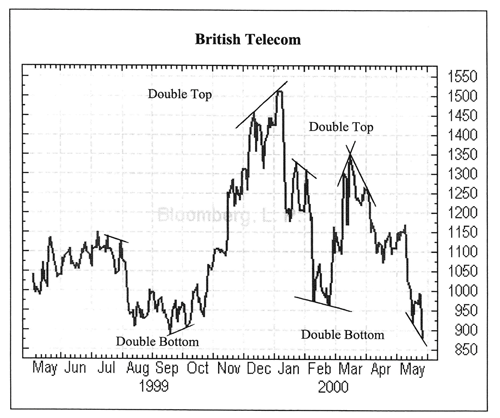
The double top is probably the most common chart pattern. Take a look at the example of the BT share price and you’ll quite clearly see two peaks. A double top occurs when the share price reaches a peak and then falls off. It then quickly rallies again to something near its original position and then falls off again.

Many traders believe that once the second peak has been reached the share price will then fall by at least 20% which is clearly what happened to BT shares in January 2000 and again in early February 2000. The opposite of a double top is a double bottom and the same principals apply.
Head and Shoulders
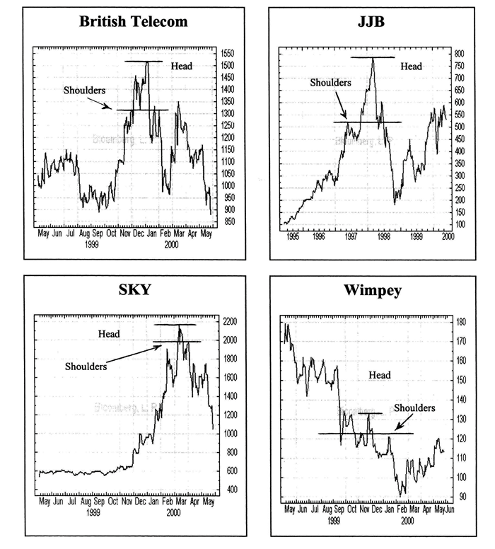
Another pattern that you can follow is head and shoulders. Here a series of three peaks occur. The two outer peaks are known as the shoulders with the middle peak being the head. The shoulders need to be of equal height and the head needs be higher than the shoulders.
The examples below show this. If a head and shoulders formation occurs and then the price dips beneath the shoulder line, it’s an indication that the share price is in decline for a period to come.
